For democracy, as for all common goods, the rule applies that (...)
it can only emerge from the work over time of an entire community
- through which - design becomes an instrument of self-affirmation
of the communities themselves" (Gasparotto S.)

Concept / Francesco Caponetti;
Art Direction - Development & Communication Strategy / Daniela Piscitelli;
Type Design & Identity design / Mina Vitale with the supervision and collaboration of Giangiorgio Fuga
Editorial System / Fiamma Puca
Packaging design & Upcycling / Rosa Fabozzo with the supervision of Carla Langella
Optimisation & Production Coordination / Rosanna Cianniello
Collaboration & Production Support / Roberta Angari
TYPE FOR PEACE /
FRUIT FOR PEACE
Type, Identity & Visual Design
Fruit for Peace is an exportable and scalable International development and cooperation model. It was born as a project of economic activation and social development designed for marginal contexts and characterized by states of endemic emergency. Today Fruit for Peace is an ongoing project promoted by Montecarlofruit and which involves institutions, designers and companies in the agricultural sector.
TYPE FOR PEACE /
a global identity
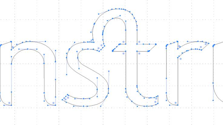
An inclusive and intercultural visual system. “Type for Peace” font is large and free of mastering elements, it doesn’t have capital letters and it’s prefigured as linear, democratic, durable and expandable. An identity system that, starting from the design of the font and all the glyphs, adapts to all the languages of the world. The sign “for” as an identity matrix in the various linguistic hybridizations.
The systemic structure of the Type for Peace typeface is divided into two directions: one is dedicated to the typical alphanumeric elements: basic glyphs, glyphs borrowed from different alphabets, accents and related tools - symbols and textures of different textures - ligatures and special glyphs.
Typography in all its forms - is for Fruit for Peace - a source of enhancement of all that is “the small”, “the next”, “the different”, “the marginal”. Visual matrix aimed at promoting a design that fulfills the "common good" as its founding objective. The other direction is a matrix and focuses on all that is the "production of form" of the font: logos, prepositions with identity signs - developed as identification monograms or synthesis of meaning, nodal elements of the logotype -, and linguistic hybridizations.


TYPE FOR PEACE /
FRUIT FOR PEACE
Thank you for your attention.
Please note that the font is still in the design phase. Stay tuned
for more details: https://montecarlofruit.com/home/fruit-for-peace/


